Orchard Physiotherapy
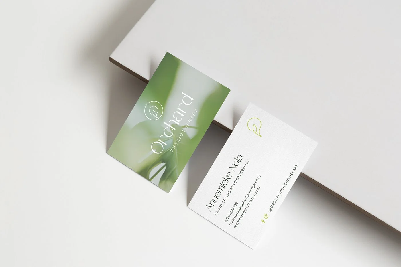
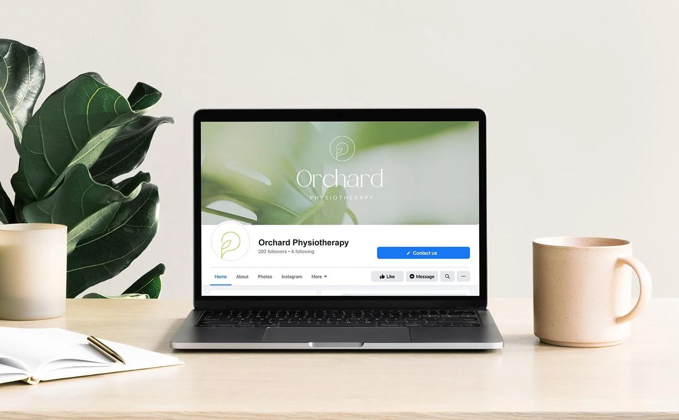
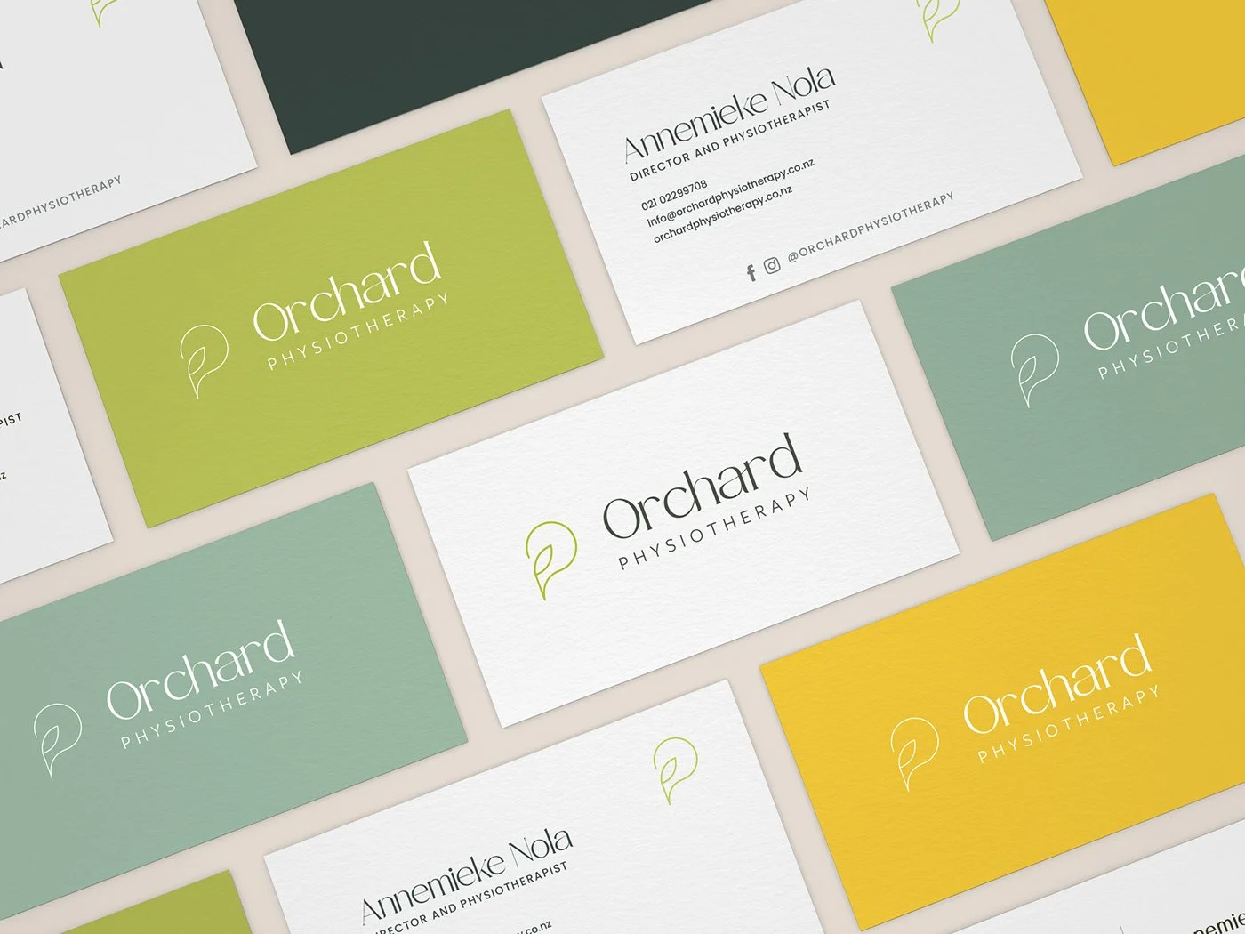
A minimal abstract approach to icon design where I’ve incorporated the initials O.P. into an icon with a simple leaf as a nod to the nature aspect.
With this design I love the subtle wave/flow of the icon design and how some of the characters in Orchard connect and flow beautifully.
The colour palette for this concept leans more towards green tones for a wellness inspired colour scheme.